
Ri Skincare
Ri was started by a physician who went looking for skincare she could trust while she was pregnant, and could not find it. What existed was made for patients, or made for a body in pregnancy. None of it was made for her face, and none of it was made for the woman she still was. Ri closes that gap. Clinical strength, made pregnancy-safe, built for the four seasons of her: fertility, pregnancy, postpartum, and motherhood. Our job was to give it a form as considered as the formulas, with the authority of a physician and the warmth of a friend who has been through it.
Project m is a supplement brand for women navigating perimenopause and menopause, formulated from ancient Chinese herbal medicine and designed to work in balance with modern Western care. It enters a category that too often feels clinical, dated, or apologetic, and it needed an identity that felt like none of those things. Our job was to build a visual world as considered as the product inside it: premium but approachable, rooted in centuries-old wisdom yet unmistakably modern, and honest enough to earn the trust of a woman who has every reason to be skeptical. What follows is how we brought that brand to life, from a single guiding idea to a complete visual system.
BRAND IDENTITY
PACKAGE DESIGN

Trusted rhythm through maternal transformation. That line is not a tagline, it is the operating system. The body changes in waves rather than straight lines, and care works the same way, in small repeated acts rather than grand gestures. Some habits you build to keep up. This one, you build to come back to yourself. Everything that follows, the marks, the textures, the palette, the pacing of the site, comes out of that one idea.
Trusted rhythm through maternal transformation. That line is not a tagline, it is the operating system. The body changes in waves rather than straight lines, and care works the same way, in small repeated acts rather than grand gestures. Some habits you build to keep up. This one, you build to come back to yourself. Everything that follows, the marks, the textures, the palette, the pacing of the site, comes out of that one idea.
The heart of the identity is a modular pattern built on the idea of the second spring. Abstract and endlessly flexible, it can bloom into something floral, soften into subtle texture, or build into something rich, adapting across packaging, print, and screen without ever losing its meaning. One idea, infinite expressions.


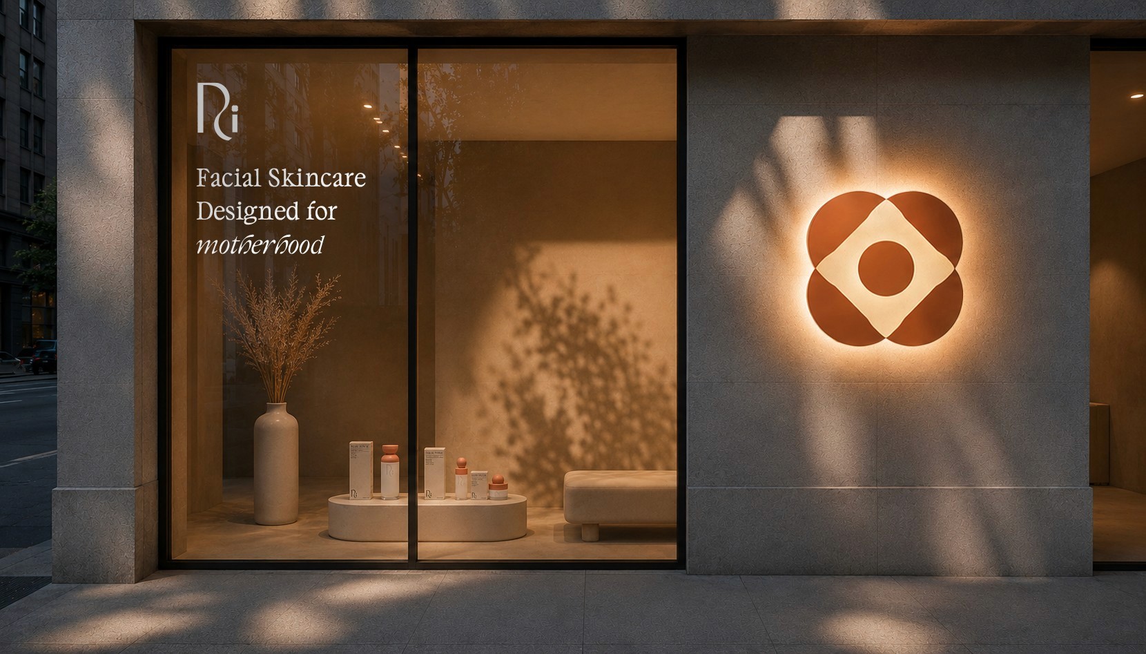
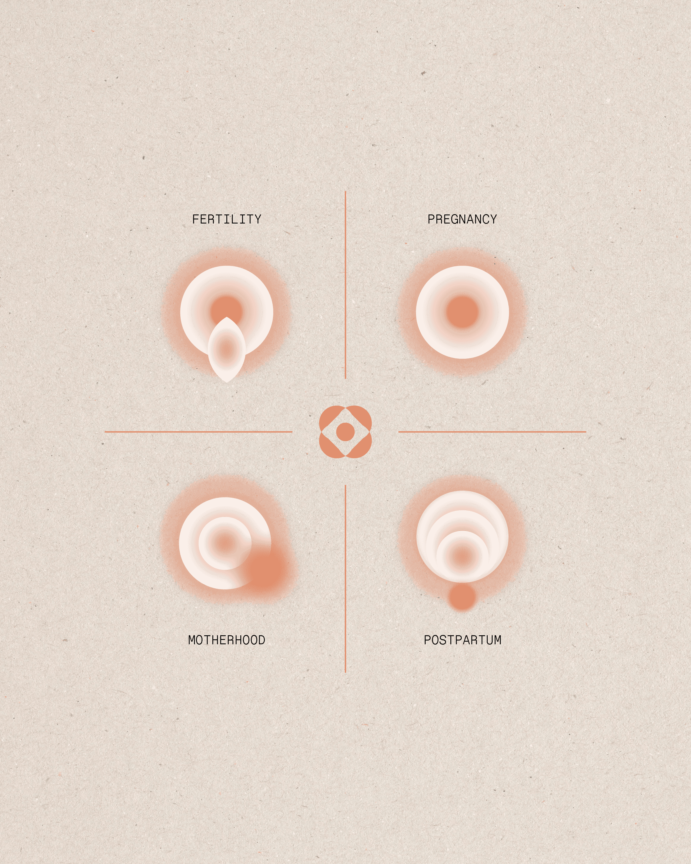
The brand mark is a circle held inside four petals. The circle is the life growing at the center of everything. The petals are a season for every stage of her journey: fertility, pregnancy, postpartum, and motherhood. It works on its own rather than locked to the wordmark, a quiet signature on a cap, a corner, a callout, wherever a small cue of Ri is enough.
The brand mark is a circle held inside four petals. The circle is the life growing at the center of everything. The petals are a season for every stage of her journey: fertility, pregnancy, postpartum, and motherhood. It works on its own rather than locked to the wordmark, a quiet signature on a cap, a corner, a callout, wherever a small cue of Ri is enough.
The wordmark is a hybrid, drawn in the space between a serif and a sans serif. It carries the weight and authority of a serif while staying clean and modern, substantial and trustworthy, yet light and contemporary. The signature detail lives in the “m.” It connects to the wordmark with a single continuous line, then transforms into a soft, italic wave, transformation drawn directly into the letterform. A quiet nod to the very transition the brand is built around.


Clementine, Bare, and Rooted carry the brand. Terracotta for its pulse, a bare cream to let it breathe, a grounded brown for depth. Around them sits a secondary palette named for what it does: Glow, Bloom, Rest, Soothe, Nurture, Renew. The rule is restraint. Light neutrals lead, darker tones arrive with intention, and most layouts hold one or two colors, never all of them.
Clementine, Bare, and Rooted carry the brand. Terracotta for its pulse, a bare cream to let it breathe, a grounded brown for depth. Around them sits a secondary palette named for what it does: Glow, Bloom, Rest, Soothe, Nurture, Renew. The rule is restraint. Light neutrals lead, darker tones arrive with intention, and most layouts hold one or two colors, never all of them.
The primary color deep calm, a deep teal that reads as elevated and trusted and does exactly what its name promises. The typography pairs a mono serif with a sans serif: the headline face is elegant and expressive, carrying the brand's warmth in italic accent words, while the mono face reads as quietly scientific, lending the credibility a wellness brand needs. Color and type hold the same balance, ancient meeting modern.


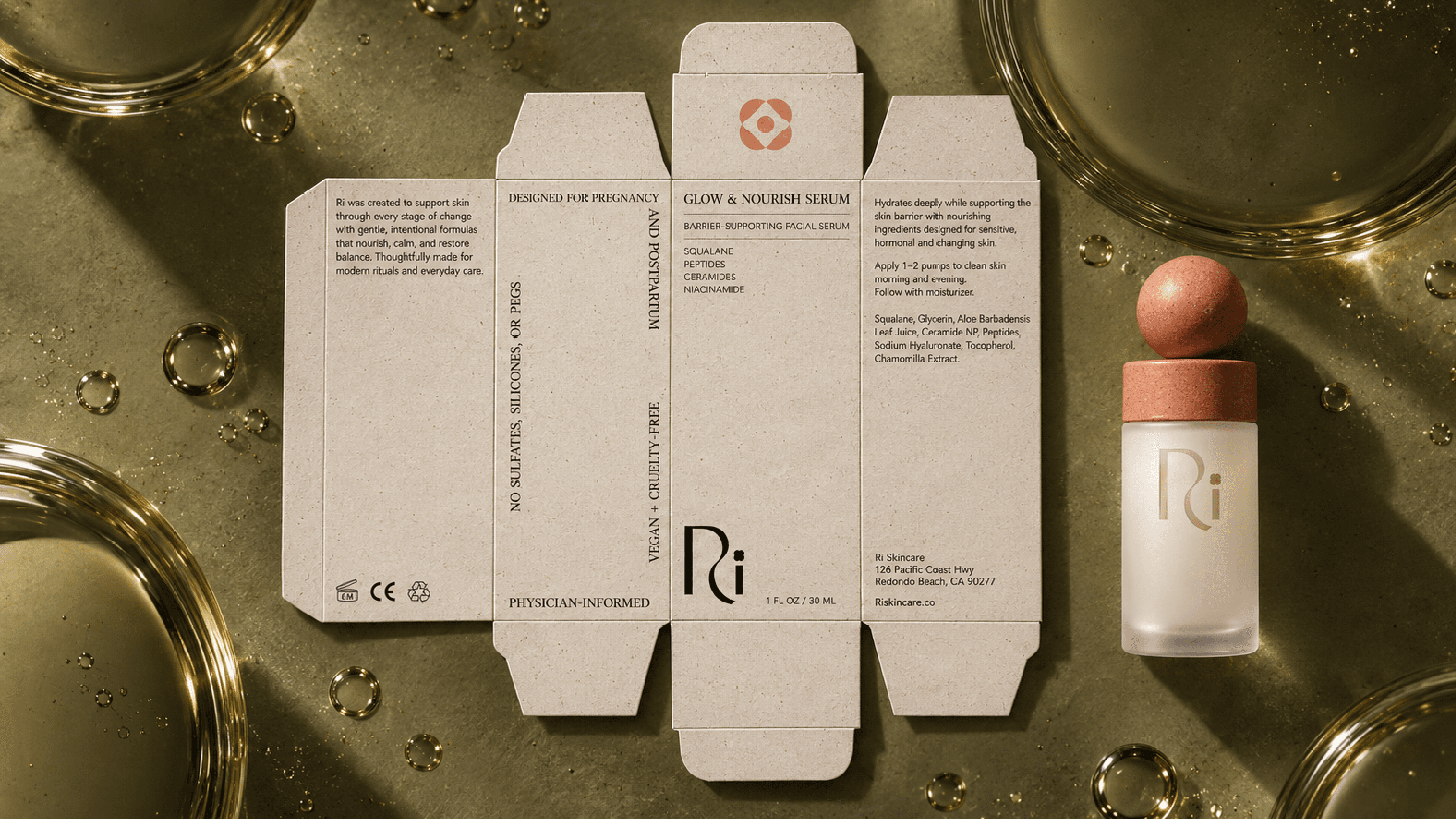
Three products, three steps. Daily Gentle, Glow & Nourish, and Calm Recovery put their ingredients on the front of the pack, because the question underneath this whole season is always the same one, and she should not have to turn the box over to answer it. Frosted glass, a terracotta sphere at the cap, and cartons where the texture becomes structure rather than ornament.
Three products, three steps. Daily Gentle, Glow & Nourish, and Calm Recovery put their ingredients on the front of the pack, because the question underneath this whole season is always the same one, and she should not have to turn the box over to answer it. Frosted glass, a terracotta sphere at the cap, and cartons where the texture becomes structure rather than ornament.


Three products, three steps. Daily Gentle, Glow & Nourish, and Calm Recovery put their ingredients on the front of the pack, because the question underneath this whole season is always the same one, and she should not have to turn the box over to answer it. Frosted glass, a terracotta sphere at the cap, and cartons where the texture becomes structure rather than ornament.
Three products, three steps. Daily Gentle, Glow & Nourish, and Calm Recovery put their ingredients on the front of the pack, because the question underneath this whole season is always the same one, and she should not have to turn the box over to answer it. Frosted glass, a terracotta sphere at the cap, and cartons where the texture becomes structure rather than ornament.


The founders wanted a website that could teach: informative, research-driven, and necessarily text-heavy. That is always the challenge on the web, where people rarely stick around to read. Through pacing, hierarchy, and breathing room, we made dense information feel light, digestible, and worth staying for.
The founders wanted a website that could teach: informative, research-driven, and necessarily text-heavy. That is always the challenge on the web, where people rarely stick around to read. Through pacing, hierarchy, and breathing room, we made dense information feel light, digestible, and worth staying for.
The founders wanted a website that could teach: informative, research-driven, and necessarily text-heavy. That is always the challenge on the web, where people rarely stick around to read. Through pacing, hierarchy, and breathing room, we made dense information feel light, digestible, and worth staying for.
The idea takes visual form as rhythmic texture, repeating flowing marks that read as water, as sound, as a season arriving. It is the brand's most distinctive signature and it is not decoration. Pressed into a carton, blown out across a wall, or softened to a whisper behind type, it holds the brand with no logo in sight.
The idea takes visual form as rhythmic texture, repeating flowing marks that read as water, as sound, as a season arriving. It is the brand's most distinctive signature and it is not decoration. Pressed into a carton, blown out across a wall, or softened to a whisper behind type, it holds the brand with no logo in sight.
The detailed macro shots of the ingredients were created with AI. Instead of a photo shoot, we art directed a series of high-texture close-ups that make each ingredient feel potent, premium, and alive, with full control over light, composition, and mood. We are open about designing with AI, it is part of how a modern studio works, and where branding is going.

The idea takes visual form as rhythmic texture, repeating flowing marks that read as water, as sound, as a season arriving. It is the brand's most distinctive signature and it is not decoration. Pressed into a carton, blown out across a wall, or softened to a whisper behind type, it holds the brand with no logo in sight.
The idea takes visual form as rhythmic texture, repeating flowing marks that read as water, as sound, as a season arriving. It is the brand's most distinctive signature and it is not decoration. Pressed into a carton, blown out across a wall, or softened to a whisper behind type, it holds the brand with no logo in sight.
The detailed macro shots of the ingredients were created with AI. Instead of a photo shoot, we art directed a series of high-texture close-ups that make each ingredient feel potent, premium, and alive, with full control over light, composition, and mood. We are open about designing with AI, it is part of how a modern studio works, and where branding is going.
The idea takes visual form as rhythmic texture, repeating flowing marks that read as water, as sound, as a season arriving. It is the brand's most distinctive signature and it is not decoration. Pressed into a carton, blown out across a wall, or softened to a whisper behind type, it holds the brand with no logo in sight.
The founders wanted a website that could teach: informative, research-driven, and necessarily text-heavy. That is always the challenge on the web, where people rarely stick around to read. Through pacing, hierarchy, and breathing room, we made dense information feel light, digestible, and worth staying for.
The founders wanted a website that could teach: informative, research-driven, and necessarily text-heavy. That is always the challenge on the web, where people rarely stick around to read. Through pacing, hierarchy, and breathing room, we made dense information feel light, digestible, and worth staying for.


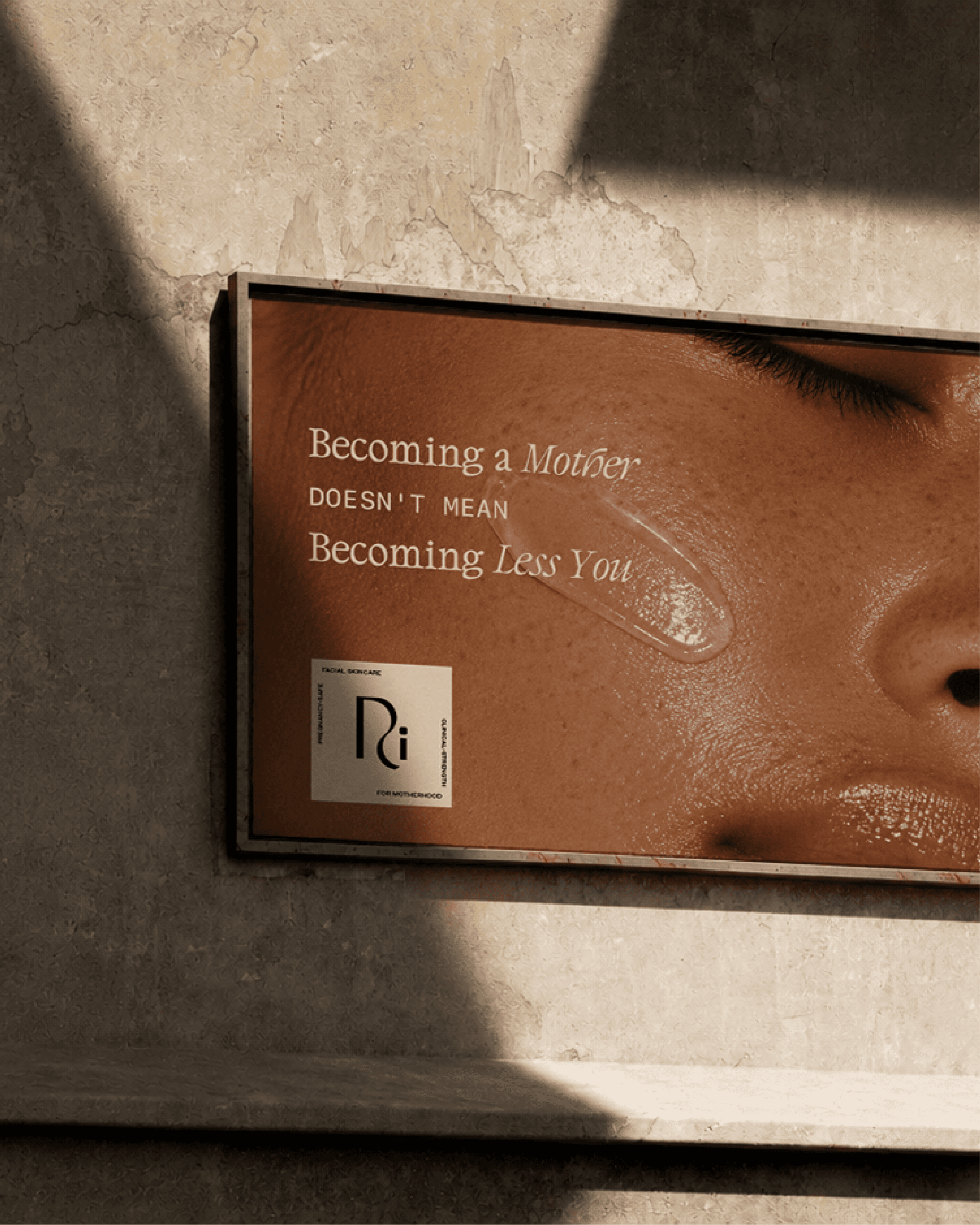
In public, the brand says the quiet part first. Becoming a mother doesn't mean becoming less you. For every phase of her journey. Badges carry the same voice at a smaller scale, science backed, physician developed, mother approved. Merchandise takes it into the everyday, a robe, a tote, a journal, objects that live in the rooms where the routine actually happens.
In public, the brand says the quiet part first. Becoming a mother doesn't mean becoming less you. For every phase of her journey. Badges carry the same voice at a smaller scale, science backed, physician developed, mother approved. Merchandise takes it into the everyday, a robe, a tote, a journal, objects that live in the rooms where the routine actually happens.
The full identity came together in a ninety-plus page brand guide, covering the logo system, color, typography, patterns, packaging, and social. More than a rulebook, it is a working tool, one that lets the team market with consistency and confidence, every touchpoint unmistakably Project M.


Project Credits
Project Credits
Thanks so much to the Ri team for the trust and collaboration on this project. It was an absolute pleasure.
Visual Creative Director
Kiki Bakowski (Self)
Features
Founder
Dr. Ariana Lundquist